
Dissolution of My Self Accessibility
No combat means no combat accessibility. The real barriers are reading, audio, motion, and subject matter.
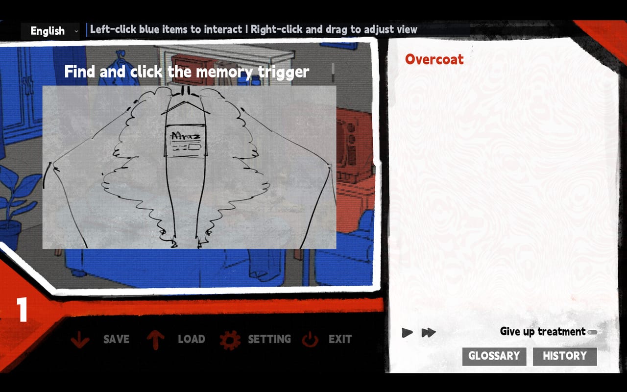
Dissolution of My Self is not a game where you can fail a combat encounter and need an accessibility option to proceed. The barriers are different: reading, audio, motion, and the weight of what the screen is depicting. This page covers what the developers have said publicly, what the demo and store page reveal, and what options exist for players who want more control.
For input issues (mouse, trackpad, gesture problems), see how to play. For system-level hardware concerns, see system requirements.
Screen shake and motion sensitivity
The Steam store page states clearly: “Later sequences use strong screen shake; players with photosensitive conditions should take care.” This is not a brief effect. The store copy treats it as a notable design element that warrants a specific warning before purchase.
The demo added mini-game hints and voice replay after Next Fest, but it did not add a screen-shake toggle. If screen shake is a physical problem for you:
- Plan breaks during intense scenes
- Reduce play session length
- Consider whether the subject matter is something you can engage with while managing a physical reaction
A motion-reducing browser plugin may help if you stream, but there is no in-game slider confirmed as of launch.
Font styling and readability
Demo testers reported that font effects made English text harder to read. The developer said they would consider a toggle. The game launched without a confirmed font-styling toggle, which means:
- Some text may use decorative styling that reduces legibility for certain readers
- Text speed is adjustable in the demo 1.0.8+ settings
- The three text languages (English, Japanese, Simplified Chinese) each use their own typographic conventions
For Japanese players, the palt OpenType feature is enabled via CSS (font-feature-settings: 'palt') to improve line-height and readability. This applies to the Japanese text rendering only.
If a line feels like it is fighting the font rather than delivering the story, slow the text speed and use voice replay to carry comprehension while your eyes rest.
Voice acting as an accessibility layer
The game is fully voiced in Japanese even when you read English or Simplified Chinese. This creates two simultaneous tracks:
- Visual: text you read in your chosen language
- Audio: Japanese performance by Netoru Irakusa (Hector) and Tetsuto Furukawa (Matvey)
For players who struggle with reading speed or text processing, listening to the Japanese voice while glancing at the text can reduce cognitive load. The demo added per-character voice volume so you can favor one character over the other.
Voice replay is available in demo 1.0.8+. If a line is delivered too fast or at a volume that makes comprehension difficult, replay it at a slower text speed before assuming the moment is meant to be confusing.
Color vision and visual design
The game uses a warm, low-light color palette (wine plasters, lamplight tones) that is not designed around color-vision accessibility as a primary concern. However:
- There is no color-coded information that gates progression
- No combat means no health-bar or status-color reliance
- Text contrast in the UI is handled through CSS variables
The main visual concern is not color-blind unsafe design; it is the atmospheric darkness and the deliberate use of shadow and blur as narrative tools.
Content that requires consent
The store page lists: self-harm, psychological manipulation, transgressive intimacy between relatives, regression, violence, substance misuse, visceral/physiological descriptions, trauma, and exile.
These are not accessibility options. They are the subject matter. The demo is the consent mechanism: 30–50 minutes to know whether you can sit with this content before spending money. This wiki does not sand down those warnings on the content warnings page either.
If the subject matter is something you need to manage around rather than opt into, the demo exists so you can make that decision with real gameplay, not a marketing description.
What is not adjustable
At launch, the confirmed adjustable settings are:
- Text speed (demo 1.0.8+)
- Character voice volume (separate from master volume, demo 1.0.8+)
- Voice replay (demo 1.0.8+)
- Fullscreen and windowed mode
- Language selection (English, Japanese, Simplified Chinese)
Not confirmed as adjustable:
- Font styling or text decoration
- Screen shake intensity
- Motion blur or atmospheric effects
When in doubt, use the demo before purchase. A 30-minute session tells you more about your physical and emotional response to the game’s motion and content than any spec sheet.
Getting help
If a genuine bug affects accessibility (e.g., text going off-screen, key prompts invisible against backgrounds), contact the studio via the mail on Links. Describe your setup, your build version (demo vs 1.0), and the specific problem. The studio has a track record of adding settings in response to demo feedback.
Frequently Asked Questions
Quick answers to the most common questions.
Is there a screen shake toggle?
Not confirmed as of launch. The store page warns about strong screen shake in later sequences. Plan breaks accordingly.
Can I reduce text speed?
Yes. Demo 1.0.8 added text speed, voice replay, and per-character voice volume settings.
Is the game readable in languages other than Japanese?
Yes. Text is available in English, Japanese, and Simplified Chinese. The CSS includes `palt` OpenType feature for Japanese line rendering.